


In the ever-evolving world of project management, tools and strategies that simplify, clarify, and improve the efficiency of managing work are invaluable. For years, companies have relied on traditional methods of tracking progress: Gantt charts, to-do lists, Kanban boards, and spreadsheets. These tools, while effective in their own right, often miss a crucial aspect of project management—making the intangible aspects of progress more visible. This is where Basecamp’s Hill Charts come in.
Developed by the creators of the popular project management tool Basecamp, Hill Charts offer a fresh, engaging, and visual way of tracking projects. Unlike linear methods, Hill Charts add a layer of narrative to progress tracking, allowing project teams to see not only where they are, but also where they’ve been and where they’re headed.
In this article, we’ll dive into how Basecamp’s Hill Charts work, why they’re different from other tracking methods, and how they are transforming the way organizations handle project progress and setbacks. Whether you’re a project manager or part of a collaborative team, understanding Hill Charts could change how you perceive project tracking and performance.
1. What Are Hill Charts?
Hill Charts are a novel method of project tracking that visualize a project’s progress as a journey up and down a hill. This simple yet elegant concept replaces the typical linear progress bar or Gantt chart with a more dynamic and fluid representation of a project’s status.
The core idea is that every project, whether it’s software development, product design, or marketing, moves through two distinct phases:
- The Climb: The early stage of the project, where things are generally uncertain and progress feels slow. This is where problems arise, solutions are tested, and teams often feel like they’re climbing a steep hill.
- The Descent: The latter stage of the project, where challenges have been resolved, and progress moves smoothly toward completion. Teams feel like they are sliding down the other side of the hill, with more clarity and confidence.
The Hill Chart doesn’t just show whether a project is ahead or behind. Instead, it provides a more nuanced view of where the project is in its lifecycle. Is the team still figuring things out (the climb)? Or are they smoothly progressing toward completion (the descent)?
2. Why Basecamp Created Hill Charts
Basecamp, a tool built for simplicity and ease of use, was always about helping teams collaborate more effectively. Basecamp’s founders, Jason Fried and David Heinemeier Hansson, wanted to address a key issue that often arose in project management: the overwhelming complexity and lack of clarity when it came to tracking progress.
Traditional methods like Gantt charts or project management tools that focus on granular deadlines can overwhelm teams with data. A Gantt chart might show a linear timeline with dozens of tasks and dependencies, but it doesn’t show how well the team is really progressing, or if the team is facing a major challenge in the middle of the project.
Hill Charts provide a simple, intuitive way of conveying the project’s status in a visual format that is both easy to understand and empowering. The concept resonates with the human experience—no one expects a project to be smooth and linear. Instead, there are moments of clarity followed by periods of doubt and problem-solving. Hill Charts make these moments visible to the entire team.
3. The Mechanics of a Hill Chart
Hill Charts are essentially a visual representation with two axes:
- The X-axis represents time or the sequence of tasks.
- The Y-axis represents the level of clarity, with higher points indicating more certainty and lower points representing more uncertainty or ambiguity.
A typical Hill Chart will start at the bottom-left corner (representing the starting point of a project) and climb upward as the team begins to tackle the challenges of the project. At some point, as problems are solved, the project moves into the descent stage, and the chart moves toward the top-right corner.
One of the most fascinating aspects of Hill Charts is that they emphasize clarity, not just completion. The goal is not just to finish tasks, but to gain clarity at every step of the way. A point on the hill chart doesn’t necessarily mean a task is complete—it simply indicates the level of certainty about that task’s resolution.
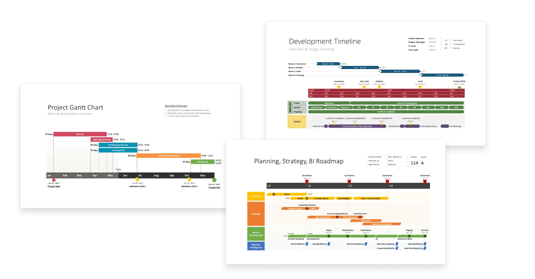
4. Hill Charts vs. Traditional Project Management Tools
Traditional project management tools often focus on two main elements: time and tasks. Gantt charts, for example, show a linear timeline with detailed tasks and milestones. While Gantt charts are useful for tracking deadlines, they don’t capture the complexity of the project’s underlying challenges. The real work in many projects happens behind the scenes, where teams are figuring out how to solve problems and moving through periods of ambiguity.
In contrast, Hill Charts focus on uncertainty and progress rather than just on tasks and timelines. This shift in perspective offers several benefits:
- More Visibility on Progress: Hill Charts help teams understand not just what’s been done but how much clarity has been gained. This creates a more accurate picture of the project’s status.
- Fewer Deadlines, More Flexibility: By focusing on the clarity of a project, Hill Charts help reduce the pressure of arbitrary deadlines and instead emphasize how well the team is managing uncertainty.
- Simplification: The simplicity of Hill Charts makes them a great tool for teams that want to get a quick, intuitive sense of where they are. Unlike complex Gantt charts, which can be overwhelming, Hill Charts provide a clear, high-level view without drowning teams in detail.
5. Benefits of Using Hill Charts in Project Management
Basecamp’s Hill Charts have a number of advantages that make them an appealing alternative to traditional project management tools. Here’s how they can benefit teams:
a. Clarity and Simplicity
Hill Charts provide a simple, visual representation of a project’s journey. The clarity of the charts means that everyone involved—whether they’re on the project team or an external stakeholder—can understand the status of a project at a glance. There’s no need to dig through layers of project management data.
b. Early Identification of Problems
By visualizing the “climb,” Hill Charts make it easy to identify when the team is struggling with ambiguity or encountering major roadblocks. This makes it easier to spot potential delays early, allowing for quicker intervention before issues snowball.
![Asana vs. Basecamp: Which is best? [2025]](https://images.ctfassets.net/lzny33ho1g45/6TGuEFZ7NHlEtI9LnKke1g/e85bd4562bc05c5692bdc11141926a11/asana-vs-basecamp-hero.jpg?fm=jpg&q=31&fit=thumb&w=1520&h=760)
c. Facilitates Team Communication
Since Hill Charts are highly visual, they make for an excellent communication tool. Teams can share updates and use the chart to discuss specific issues or challenges they’re facing in the climb phase. The team can also celebrate when the chart reaches the descent phase, signaling that the project is moving forward smoothly.
d. Flexible, Adaptable Tracking
Unlike traditional project tracking tools that lock teams into rigid timeframes and task lists, Hill Charts allow for a more organic form of tracking. Projects are rarely linear, and Hill Charts acknowledge this by giving room for flexibility.
e. Improves Morale and Motivation
The visual progression up the hill can be a great motivator for teams. It’s a simple, rewarding way to see progress—not just through task completion but through the increasing clarity of the project’s direction.
6. How to Implement Hill Charts in Your Project Management Process
Basecamp’s Hill Charts are integrated into its project management tool, so teams using Basecamp already have access to this feature. But even if you’re not using Basecamp, you can apply the Hill Chart concept to any project, especially when it comes to visualizing progress and managing uncertainty.
a. Begin by Mapping Out the Project
Start by identifying the key milestones and tasks within the project. These will form the framework for your Hill Chart. You don’t need to create a task list for every minor detail, but identify the major obstacles or points of uncertainty along the way.
b. Plot the Project’s Journey
On your Hill Chart, begin by plotting the progress of the project on the X-axis (time) and Y-axis (clarity). Start at the bottom-left, and as you move through the project, adjust the chart to reflect whether the team is moving up (increasing clarity) or down (facing ambiguity).
c. Update Regularly
Regularly update the Hill Chart as the project progresses. Don’t be afraid to adjust the trajectory of the project as new challenges arise or solutions are found. This is where the flexibility of Hill Charts shines.
d. Communicate with the Team
Use the Hill Chart to facilitate discussions in your team meetings. Talk about where the project is on the climb or descent and what challenges need to be tackled. Use the chart to visualize success and setbacks, which can be powerful for team morale.
7. Conclusion
Basecamp’s Hill Charts offer a refreshing alternative to traditional project management methods by adding a visual and intuitive layer of understanding to project tracking. They focus on clarity and progress rather than rigid timelines and tasks, allowing teams to gain a deeper understanding of where they are in the project lifecycle.
The dynamic nature of Hill Charts makes them especially effective for teams facing complex, non-linear challenges, which is the reality for many projects in today’s fast-paced work environment. With Hill Charts, project managers can reduce ambiguity, identify issues early, and keep their teams motivated and focused on what really matters: clarity and progress.
By rethinking how we track projects and how we visualize success, Basecamp’s Hill Charts could very well revolutionize the way we manage work—transforming the chaotic and stressful nature of projects into something that feels more like a journey up and down a hill, where every step forward, no matter how small, brings us closer to success.


